Header
HTML CSS Project
1. Basic
note : JS_L37 onwards
1. Create project struture - resource, img, css,etc folders + index.html .
2. add link in index.html for normalized.css, app css(style.css), and google font.
<link href="https://fonts.googleapis.com/css?family=Lato" rel="stylesheet">
2. Intial styling
-
Clear browser defaults.
* { margin: 0; padding: 0; box-sizing: border-box; } -
Set background-color and color for entire app
body {
    background-color: #fff;
    color: #555;
    font-family: 'Lato', 'Arial', sans-serif;
    font-weight: 300;
    font-size: 20px;
    text-rendering: optimizeLegibility;
}
text-rendering: optimizeLegibility --> this will help in perfect rendering.
font-weight: 300 -->
3. Responsive WEB design - theory
- it means it should work in any device of any resolution, without zoom-in and out.
- it should get changed automatically as per browser size.
- 50 % of moble traffic is of Mobile users, as per google; Increase in future. hence emracing mobile friendly design.
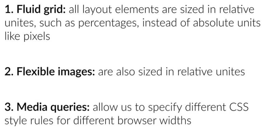
- Three ingredient for responsive website:
- go : http://www.responsivegridsystem.com/
and generate css file. everything is already compiled in sinle file -
./vendor/css/grid.cssNote : Will Check later how grid works.
4. Add Header - part-1
<Header class="ui-tech-test-box">- Horizontally center container
-
It may contain some heading elements but also other elements like a logo, a search form, an author name, and so on.
-
Add image in viewport, Blur image with black
header { background-image: linear-gradient(rgba(28, 25, 25, 0.85), rgba(28, 25, 25, 0.85)), url(img2/header-bg-2.jpg); background-position: center; background-size: cover; height: 100vh; /* The vh unit can be used to fill the background of the viewport */ } -
Set
<header>in center:.ui-tech-test-box { position: absolute; width: 1140px; top: 50%; left: 50%; transform: translate(-50%,-50%); }
outPut:

5. Add Header - part-2
-
Improvement 1:
header { ... color: #fff ; font-size: 200% ; /* 6.1 body:20px, hence 40px */ font-weight: 100; /* 6.2 thickness */ text-transform: uppercase; letter-spacing: 1px; word-spacing: 20px; } -
buttons ans style:
outPut:template: <a href="#" class="btn btn-lime"> Learn UI technologies</a> <a href="#" class="btn btn-tan"> Show More</a> Style: .btn { display: inline-block; padding: 20px 40px; font-weight: 300; text-decoration: none; border-radius: 50px; color: #fff; } .btn-lime { color: #e74c3c; border: 2px solid #e74c3c; } .btn-tan { background-color: #009688; border: 2px solid ##2ecc71; }
-
Add Button style on :
.btn-tan:link, .btn-tan:visited { color: #fff; background-color: #1abc9c; border: 2px solid #2ecc71; } .btn-tan:active, .btn-tan:hover { color: #2d3317; background-color: #16a085; border: 2px solid #2d3317; } - Add animation
.btn-tan:active, .btn-tan:hover { color: #2d3317; background-color: #16a085; border: 2px solid #2d3317; transition: background-color 2.5s, border 2.5s, color 0.5s ; } - Add logo and nav bar
outPut:
template :

<nav>
            <div class="row">
                <img class="logo" src="resources/img2/logo.PNG">

                <ul class="main-nav">
                    <li><a href="#">About</a></li>
                    <li><a href="#">Sign up</a></li>
                    <li><a href="#">sign in</a></li>
                </ul>
            </div>
        </nav>

Style:

.main-nav {
    float: right;
    list-style: none; /**/
    margin-top: 55px;
}

.main-nav li {
    display: inline-block;  /**/
    margin-left: 40px;
}

.main-nav li a:link, .main-nav li a:visited {
    color: #fff;
    font-size: 70%;
    border-bottom: 3px solid transparent;
}

.main-nav li a:hover, .main-nav li a:active {
    color: #e74c3c;
    border: 1px solid #fff;
    border-bottom: 3px solid #e74c3c;
    padding: 8px;
    transition: border-bottom 1.0s;
}

.logo {
    height: 100px;
    width: auto;
    float: left;
    margin-top: 20px;
}